
Want to build a website that wows? Follow these 10 essential web design rules—mobile-first, speed, whitespace, and more. Start now.
Creating a website that captivates visitors is both an art and a science. It requires a blend of creativity and strategic planning.

In this guide, we will explore ten essential design rules. These rules will help you build a website that not only looks great but also functions seamlessly.
Whether you’re a seasoned designer or a beginner, these tips will enhance your web design skills. Let’s dive into the world of website design that truly wows.
Why Design Matters: The Power of First Impressions
First impressions on the web are crucial. A well-designed website captures attention and creates trust quickly.
Poor design can lead to higher bounce rates. Users might leave if they find the website difficult to navigate or visually unappealing.
10 Essential Website Design Rules
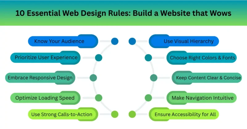
Creating a website that wows involves following key rules. Each rule helps you enhance different aspects of your web design. Let’s explore these fundamental website design rules:
- Know Your Audience: Understand what your users need and tailor your design to those preferences.
- Prioritize User Experience (UX): Ensure your website is easy and pleasant to use for all visitors.
- Embrace Responsive Design: Your site should look amazing on any device, whether it’s a phone, tablet, or desktop.
- Optimize Loading Speed: Fast-loading websites keep users engaged and improve search engine rankings.
- Use Visual Hierarchy: Design your layout to guide the user’s eye to the most important elements first.
- Choose the Right Colors and Fonts: Align your design elements with your brand’s identity and message.
- Keep Content Clear and Concise: Communicate your message effectively by using straightforward and brief text.
- Make Navigation Intuitive: Users should navigate your site easily without having to think about it.
- Ensure Accessibility for All: Design inclusively to accommodate users with varying abilities and needs.
- Use Strong Calls-to-Action (CTAs): Direct users to take desired actions with clear and compelling prompts.
Pro Tips for a Website That Truly Wows
To truly impress, go beyond the basics. Here are some expert tips that elevate your website from good to great. Integrate these strategies to captivate your audience:
- Utilize storytelling to create an emotional connection.
- Regularly update content for freshness and relevance.
- Use analytics to understand user behavior and refine design.
FAQs
Q. Why is mobile-first design no longer optional?
Over 60% of global web traffic comes from smartphones, and Google exclusively uses the mobile version of your site for indexing and ranking.
If your site isn’t built mobile-first, you’ll face slow load times, broken layouts, and a penalty in search results, driving potential customers straight to faster, mobile-ready competitors.
Q. How much whitespace is too much for clean web design?
Whitespace isn’t wasted space, it’s a visual breathing room that boosts comprehension by up to 20%. Too little makes content feel cramped and chaotic, while too much (large empty voids without purpose) confuses the user’s eye.
The sweet spot: enough padding to separate elements clearly, but not so much that key actions feel lost.
Q. What’s the single biggest speed mistake beginners make?
Uploading raw, unoptimized images straight from a camera or stock site—often 5MB or larger per photo.
This single mistake can balloon page weight to 10MB+ and triple load times. Always compress images, switch to WebP format, and lazy-load below-the-fold content to stay under 2.5 seconds.
Q. What are the 3 most important web design rules for SEO?
Clean, descriptive URLs (e.g., /blue-widgets not /p=123), fast Core Web Vitals (LCP under 2.5s, no layout shifts), and proper heading hierarchy (H1 → H2 → H3).
Google treats user experience as a ranking factor, so following these three rules directly improves both design quality and organic search visibility.
Q. Why should I choose a pre-built template over custom design?
Templates let you launch in days with battle-tested layouts, built-in responsiveness, and lower cost—ideal for small businesses and portfolios.
Custom design only makes sense when you need unique functionality, complex data visualizations, or strict brand differentiation that no template can offer. For most sites, start with a premium template and customize from there.
Q. How do I choose the right color scheme for my brand website?
Start with the 60-30-10 rule: 60% neutral background, 30% primary brand color, 10% accent color for CTAs.
Then verify contrast using a tool like WebAIM—don’t trust your monitor alone. Avoid choosing colors based on personal taste; instead, test for readability, emotional fit with your industry, and accessibility for color-blind users.
Final Thoughts: Keep Improving Your Website
Great web design isn’t about flashy animations or crowded layouts—it’s about clarity, speed, and respecting your visitor’s time.
By applying these 10 essential rules, from mobile-first structure to smart color choice and image optimization, you transform a basic site into a trust-building, high-conversion machine.
Remember, your website is your brand’s digital handshake. Make it firm, fast, and memorable.
Call to Action
Ready to wow your audience? Start with one rule today: audit your site’s mobile load time or test your color contrast. Then, drop a comment below, which of these 10 rules will you fix first? And don’t forget to share this post with a fellow business owner who needs a website refresh.
Happy designing!